You have a Pantone number — off a brand guideline, a printed business card, or a fan deck a client handed you — and now something physical has to be painted to match it: an accent wall, a shopfront, a reception desk, a run of cabinet doors.
The first thing worth knowing is that there is no official Pantone-to-paint chart, and no paint company publishes one. Behr, Benjamin Moore, Sherwin-Williams, Dulux and Farrow & Ball each maintain their own independent color collections, and nothing connects them to Pantone. Every conversion you will find, including the ones on this site, is a nearest-match calculation rather than a lookup in a shared table.
That is not a reason to give up on it — it is a reason to know how close you actually got, which is the part most conversion charts leave out. If the Pantone system is new to you, our guide to what Pantone is covers how spot inks work; if your brand book lists both a C and a U version of one number, the coated versus uncoated explainer matters here more than you would expect.
Why Pantone-to-Paint Matching Is an Approximation, Not a Formula
A Pantone spot color is defined by a physical printed standard: a published recipe mixed from a small set of base inks, printed on a specified paper stock. The chip in the fan deck is the color, and the number is a pointer to that physical object.
Architectural paint is a different product entirely. A gallon of Behr or Benjamin Moore is a tinted base — acrylic or alkyd binder loaded with titanium dioxide — dosed with colorants at the store. Different pigments, no paper, and a surface you view from six feet away in changing light, at a sheen level you also get to choose.
With no shared physical reference between the two systems, all a converter can do is translate both sides into a device-independent color space and find the closest neighbor.
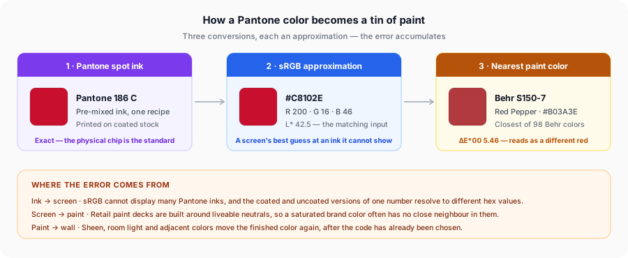
The measurement that keeps this honest is ΔE*00 (CIEDE2000), the standard for how different two colors look to a human eye. Our converters rank every result by it, and the bands are the whole game:
- Under 1 — not perceptible, even if you look for it.
- 1 to 2 — a commercial match, visible only side by side under good light.
- 2 to 5 — visible at a glance, acceptable for most interior work.
- 5 to 10 — clearly a different color, but the same family.
- Above 10 — a different color, whatever it gets called.
The side-by-side comparison tool applies the same measurement between two Pantone colors, which is a quick way to build intuition for what a given ΔE looks like before you trust one on a wall.
Check which suffix your brand guideline specifies before you convert. Pantone 186 C and 186 U are the same ink on different paper and resolve to noticeably different values, so they land on different paint colors. If the guideline gives both, match the coated value for gloss or satin and the uncoated value for a flat or matte wall.
Step-by-Step: Finding the Closest Paint Match for Any Pantone Color
The mechanics of each converter are covered on the tool pages. What follows is the decision sequence around them, which is what actually determines whether you like the wall.
- Pin down the exact code, suffix included. "Pantone 186" is ambiguous; 186 C is not.
- Choose the brand before you match, not after. Availability is the real constraint: there is no point finding a beautiful Farrow & Ball match if the job is being painted on Tuesday by a contractor who buys everything at Home Depot.
- Read the ΔE figure, not just the swatch. Two chips can look identical on a phone and be six ΔE apart. The number is the reliable signal; the rendered swatch is not.
- Set your threshold against the job. A feature wall in a café can live with ΔE 4. A logo wall sitting beside printed signage in the same color cannot.
- Order sample pots for your top two or three results, not just the first. The ranking comes from nominal values; paint is what you are buying.
- If nothing lands under about 5 on a brand-critical color, stop matching. Take a physical Pantone chip to a paint counter for a custom tint — in-store spectrophotometer matching beats any stock code, and all five brands offer it.
Pantone to Behr
Behr is sold almost exclusively through The Home Depot in North America, and that single fact decides when to reach for it. When a project needs paint today from a store that is open late and tints on site, Behr is often the only realistic answer — which makes the Pantone to Behr converter most useful for rental turnovers, pop-up retail, small fit-outs, and anything where the painter is already standing in the aisle.
Behr codes come in two shapes, and quoting the wrong one wastes a trip to the paint desk. The main range uses a grid reference such as N200-2 or S150-7, where the letter and first number locate a color family and the trailing digit sets depth. Alongside those sit prefixed codes — PPU for Premium Plus Ultra, MQ for Marquee, HDC for the Home Decorators Collection — so always give the complete code.
Pantone to Benjamin Moore
Benjamin Moore sits at the premium end of the North American market and sells through independent dealers rather than big-box retail. Its catalog runs to roughly 3,500 colors — the deepest of the five brands here — and that depth shows up directly in match quality, particularly across off-whites and mid-tone neutrals.
Codes carry a collection prefix worth knowing: HC is Historical Color, OC is Off-White, AF is Affinity (built so any two of its colors coordinate), and CC is Color Preview, the saturated end. Plain numeric codes like 2062-10 belong to Classic Colors. Try the Pantone to Benjamin Moore converter first when the color is a considered interior neutral and you have a dealer nearby.
Pantone to Sherwin-Williams
Sherwin-Williams runs its own store network across North America and serves trade and retail from the same counter, which makes it the default specification on a great many US commercial projects. Its Color Collection runs to around 1,700 colors, each with a four-digit SW number and a name — though the number is a catalog position, not a description, so SW 7015 tells you nothing the way an NCS notation would.
The Pantone to Sherwin-Williams converter is weighted toward the heavily specified neutrals that dominate American interiors, which is where it performs best: Cool Gray 9 C lands on SW 7665 Wall Street at ΔE 0.61, a match you could not pick out in a lineup.
Pantone to Dulux
Owned by AkzoNobel, Dulux is dominant across the United Kingdom, Ireland, Australia and New Zealand — in Britain it is close to a generic term for household emulsion. If your project sits in any of those markets the decorator is almost certainly buying Dulux Trade, and the Pantone to Dulux converter is where a brand color has to land before anything gets ordered.
One complication is worth flagging: Dulux is not one global color range. The UK and Australian collections overlap but are not identical, and Dulux in North America is a separate business with its own palette entirely. A name that exists in Sydney may not exist in Manchester, so confirm it is stocked in your market. Most Dulux trade counters will also tint to an RAL or BS number, which is often more precise for specification work than a name off a consumer chart.
Pantone to Farrow & Ball
Farrow & Ball is the outlier, and knowing why makes the conversion more useful. It publishes roughly 130 colors against Benjamin Moore's 3,500, and that constraint is the product rather than a limitation: the palette is curated to work together, the colors carry unusually high pigment loads with deliberately complex undertones, and the names do real work in the design press — Elephant's Breath, Hague Blue, Railings, Mole's Breath.
The consequence is that the Pantone to Farrow & Ball converter returns higher ΔE figures than any other paint tool here — an accurate description of the palette rather than a fault in the matching. Mapping 1,565 Pantone coated inks onto 130 curated colors leaves most Pantone colors without a close neighbor, and saturated brand colors without any. Used correctly it answers a different question: not "what is the exact match" but "where does my color sit within a palette the client has already committed to."
Paint Brand Comparison
| Brand | Primary Market | Approx. Color Count | Price Tier | Best For |
|---|---|---|---|---|
| Behr | US & Canada (Home Depot only) | ~2,000+ * | Value to mid | Fast turnaround, DIY, rentals, pop-ups |
| Benjamin Moore | US & Canada (independent dealers) | ~3,500 | Premium | Considered interiors, neutrals, cabinetry |
| Sherwin-Williams | US & Canada (own stores) | ~1,700 | Mid to premium | US commercial specification, trade work |
| Dulux | UK, Ireland, Australia, NZ, Asia | Varies by market * | Mid | UK/EU/AU projects, trade decorating |
| Farrow & Ball | UK-based, sold internationally | ~130 | Luxury | Heritage work, designer schemes, joinery |
* Two of these counts need care. Behr publishes no single authoritative figure; around 2,000 is commonly cited, but we could not verify it against a primary source — treat it as an order of magnitude. Dulux has no global count at all, because the UK, Australian and North American ranges are separate collections run by different businesses. The other three figures are the ones those companies use themselves.
The converters here match against curated subsets rather than complete decks — 98 Behr colors, 121 Benjamin Moore, 124 Sherwin-Williams, 87 Dulux, 129 Farrow & Ball — weighted toward what actually gets specified. So a poor result is sometimes a limit of the subset rather than proof the brand has nothing closer.
Which Pantone Colors Actually Match Well
Match quality depends far more on which Pantone color you started with than on which brand you chose. Here is what the converters here return for six real Pantone colors, taking the best result across all five brands:
| Pantone Color | Character | Closest paint match found | ΔE*00 | Verdict |
|---|---|---|---|---|
| Cool Gray 9 C | Mid neutral gray | SW 7665 Wall Street | 0.61 | Near-exact |
| 7686 C | Mid-depth blue | BM 2062-10 Blue | 0.67 | Near-exact |
| 186 C | Saturated brand red | Behr S150-7 Red Pepper | 5.46 | Fair |
| 2955 C | Deep navy | BM 2063-10 Symphony Blue | 5.79 | Fair |
| 448 C | Dark olive-brown | SW 7020 Black Fox | 8.27 | Fair |
| 5535 C | Very dark green | BM 2128-10 Forest Green | 8.68 | Fair |
The cause is straightforward. Retail paint collections are built around colors people want to live with — neutrals, off-whites, grays, muted mid-tones — so that is where the available colors are densest, and where a nearest-neighbor search finds something close. Saturated and very dark colors sit in regions of color space that paint decks barely populate, not because the pigments do not exist but because almost nobody paints a domestic wall in a high-chroma primary red.
So if your color is a corporate red, a bright orange or a fluorescent, expect mid-single-digit ΔE at best from any stock deck.
Getting an Accurate In-Person Match
Everything up to this point happens on a screen. The remaining error is physical, and there are three things worth doing.
Sample on the actual wall before you commit. Paint a patch at least two feet square, or use a peel-and-stick sample. Look at it in the morning, in the afternoon, and under the lamps the room uses at night. This is not a formality — it is where the decision really gets made.
Understand metamerism. Two colors that match under one light source can differ visibly under another, because paint and ink pigments reflect light across different parts of the spectrum. A match made under a store's cool fluorescents can fall apart under warm domestic LEDs. This is why ΔE is a starting point and not a guarantee — it is calculated for one standard illuminant, and your room is not it. Where paint sits beside printed material in the same color, view both together under the real lighting before signing off.
Check the LRV. Light Reflectance Value runs from 0 (theoretical black) to 100 (pure white), and all five brands publish it per color. It predicts how a color behaves in a room far better than the swatch does: below about 20 reads as genuinely dark and will eat the light in a north-facing space, above 60 reads as light and bounces it around.
There is a shortcut. LRV tracks the CIELAB L* value our converters already show for every Pantone color, but the two are not the same number — L* is perceptually spaced, LRV is linear reflectance — and the conversion is steeper than most people expect:
| CIELAB L* | Approx. LRV | Reads as |
|---|---|---|
| 30 | 6 | Very dark |
| 50 | 18 | Dark |
| 70 | 41 | Mid |
| 90 | 76 | Light |
So Pantone 186 C, at L* 42.5, implies an LRV near 13 — a genuinely dark wall, which surprises people who think of it as a bright red. Pantone 5535 C, at L* 17.7, lands near LRV 2. Worth the thirty seconds before you buy five gallons.
For a brand-critical color, skip the stock code and take a physical Pantone chip to the paint counter for a spectrophotometer match. Bring the fan deck chip, not a printout — a desktop printer cannot reproduce a spot color accurately, so you would get a careful match to the wrong color.
Frequently Asked Questions
Related Tools
See the ΔE*00 difference between any two Pantone colors side by side.
Start from a brand hex code and find the Pantone color first.
Search our reference set of PMS color approximations to confirm your exact code and suffix.
The European standard most trade paint counters will tint to directly.
Natural Colour System notation, widely specified in Scandinavian architecture.
The device-independent values ΔE and LRV are actually calculated from.
Convert your Pantone color now
Pick the brand your painter actually buys, then check the ΔE before you order anything. Every result is ranked by CIEDE2000 and runs entirely in your browser.