Pantone is the color standard most designers learn first, and outside print it is frequently the wrong one to be holding. Order a powder-coated façade panel in Germany quoting a PMS number and the fabricator will ask you for a RAL code. Send a Swedish architect a brand book full of Pantone references and the paint schedule will come back in NCS. Print a brochure in Munich and the shop may quote HKS ink prices.
None of these systems is a competitor to Pantone in the ordinary sense. They were built for different materials, in different decades, by different industries, and each one is the default in its own territory. Knowing which applies is usually more valuable than knowing how to convert between them — though we will get to the conversions too, with real numbers on how close they actually land.
What Is RAL?
RAL is the European standard for industrial coatings. It dates to 1927, when the German Reichs-Ausschuß für Lieferbedingungen — the state committee for delivery terms whose initials give the standard its name — published forty colors so suppliers and buyers could agree on a shade without posting physical samples back and forth.
That list became RAL Classic, which today holds 213 colors and remains the color language of European paint, powder coating and metal fabrication. Its codes are four digits, and the first digit is not arbitrary:
| First digit | Hue family | Example |
|---|---|---|
| 1 | Yellow | RAL 1023 Traffic yellow (Verkehrsgelb) |
| 2 | Orange | RAL 2004 Pure orange (Reinorange) |
| 3 | Red | RAL 3020 Traffic red (Verkehrsrot) — the European signal red |
| 4 | Violet | RAL 4005 Blue lilac (Blaulila) |
| 5 | Blue | RAL 5010 Gentian blue (Enzianblau) |
| 6 | Green | RAL 6018 Yellow green (Gelbgrün) |
| 7 | Gray | RAL 7016 Anthracite grey (Anthrazitgrau) — ubiquitous on modern façades |
| 8 | Brown | RAL 8017 Chocolate brown (Schokoladenbraun) |
| 9 | White or black | RAL 9010 Pure white (Reinweiß), RAL 9005 Jet black (Tiefschwarz) |
So RAL 5010 is a blue before you look it up, and RAL 7016 Anthrazitgrau — the anthracite gray covering a great deal of modern European window and façade hardware — is unmistakably a gray. The remaining three digits just place the color within its family and carry no further meaning.
RAL Classic is one deck among several. RAL Design System plus organizes roughly 1,800 colors on a systematic hue–lightness–chroma grid for architects, RAL Effect covers waterborne paints including metallics, and RAL Plastics carries the standard into molded polymer. Classic is what gets quoted on the overwhelming majority of powder-coating, signage and joinery orders.
What Is NCS (Natural Colour System)?
NCS describes color the way people see it rather than by how it is manufactured. Developed in Sweden and formalized as a national standard in 1979, it rests on the observation that human vision resolves any color in terms of six elementary perceptions: white, black, and the four unique hues yellow, red, blue and green.
The payoff is that the notation is readable. In NCS S 1080-Y90R, the S marks a Standard sample, 10 is 10% blackness, 80 is 80% chromaticness — saturation relative to a pure color — and Y90R is the hue, 90% of the way from yellow toward red. Anyone fluent in the system pictures a strong clean red without touching a fan deck. A code ending -N is neutral, so NCS S 3000-N is a mid gray with no hue at all.
Published by NCS Colour AB in Stockholm, it is the dominant standard in Swedish, Norwegian and Danish architecture and paint retail, and is written into building specifications across much of northern Europe. Its particular strength is the muted, desaturated range that makes up most built environments — exactly where RAL Classic is thin.
NCS is the only one of these four systems you can interpolate. Because the notation describes a position in a continuous perceptual model rather than pointing at a catalog entry, a color can be specified between two published notations. Pantone, RAL Classic and HKS numbers are catalog positions, so there is no meaningful midpoint between two of them.
What Is HKS?
HKS is a spot-color ink system created in Germany in 1976 and named for its three founding ink manufacturers — Hostmann-Steinberg, Kast + Ehinger and H. Schmincke & Co. It was built to do for German-language offset printing what Pantone does elsewhere.
It is organized around 88 base colors, HKS 1 through HKS 88, published across four decks matched to paper type: K for gloss art, N for natural and uncoated, E for continuous stationery, Z for newsprint. A specification always carries its deck letter, because HKS 43 K and HKS 43 N are the same ink on very different surfaces and do not look alike. Alongside the base colors, the 3000-series fan decks extend them into several thousand tints and shades, though brand work almost always references a base number.
HKS is genuinely dominant in Germany, Austria and Switzerland, where a printer is as likely to stock HKS inks as Pantone ones, and public-sector identities frequently specify it exclusively.
How Pantone Differs From All Three
The clearest way to see the difference is to ask what each number is.
A Pantone number is a recipe. It tells a printer which base inks to mix and in what proportion, and it is defined by a physical printed chip. It describes nothing — 186 C tells you it is not 185 C and nothing more. Our guide to what Pantone is covers how the ink mixing works in detail.
A RAL number is a coating specification, cured onto metal, plastic or timber, where gloss level and substrate change the result. An NCS notation is a description of an appearance, independent of any material or manufacturer. An HKS number is, like Pantone, an ink recipe — which is why HKS is the only one of the three that is genuinely the same kind of object as Pantone.
That distinction matters more than it sounds. Two ink systems can be compared directly. An ink system and a coating standard were never meant to map onto each other at all, which is why every Pantone-to-RAL result is an approximation rather than a lookup.
Comparison Table
| System | Region of Origin | Primary Industry | Approx. # of Colors | Typical Format |
|---|---|---|---|---|
| Pantone | United States, 1963 | Print, packaging, brand identity | 1,565 coated; 3,600+ across all decks | Fan deck (Formula Guide) plus licensed digital libraries |
| RAL | Germany, 1927 | Industrial coatings, architecture, signage | 213 in RAL Classic; ~1,800 in RAL Design System plus | Fan deck and coated metal or plastic chip panels |
| NCS | Sweden, 1979 | Architecture, interiors, paint retail | 1,950 standard colors; the model itself is continuous | Fan deck, index atlas, painted sample chips |
| HKS | Germany, 1976 | Offset printing in German-speaking Europe | 88 base colors, plus several thousand tonal variants | Four fan decks by paper type — K, N, E and Z |
Converting Between Systems
Every conversion here is a nearest-neighbor search in a perceptual color space, ranked by ΔE*00 (CIEDE2000). Under 1 is imperceptible, under 2 is a commercial match, 2 to 5 is visible but usually acceptable, and above 5 reads as a different color.
Pantone to RAL is the most common request on this site, and it is the one where the material gap is widest — ink on paper becoming powder on steel. The Pantone to RAL converter matches against all 213 RAL Classic colors, so its results are limited by the deck itself rather than by any sampling on our part.
RAL to Pantone runs the other way and is usually easier, because the Pantone deck is far larger than RAL Classic. If you have a façade or fleet color and need printed collateral to match it, start from the RAL code rather than eyeballing a hex value off a rendering. For a RAL code's screen value, use the RAL to HEX chart; to go from a hex value to the nearest RAL, use HEX to RAL.
Pantone to NCS is the one to reach for when a brand color has to enter a specification governed by northern European norms. The Pantone to NCS converter matches against 85 widely specified NCS standard colors rather than the full 1,950, so treat a poor result as a limit of that subset rather than proof the system has nothing closer.
Pantone to HKS is routine work for anyone printing in the German-speaking market, and it behaves differently from the other three — see below. The Pantone to HKS converter matches against the 88 base colors, since those are what specifications quote and what ink suppliers stock.
How close do they actually get?
We ran every coated Pantone color in our database — 1,537 entries — against each system and measured the closest match. The result is not what the "both are printing inks" logic predicts:
| System | Matched against | Saturated colors | Muted colors | Overall mean ΔE |
|---|---|---|---|---|
| RAL Classic | 213 (the complete deck) | 6.24 | 6.51 | 6.75 |
| NCS | 85 (of 1,950 standard colors) | 7.40 | 7.21 | 7.23 |
| HKS | 88 base colors | 7.99 | 16.55 | 12.65 |
Saturated means CIELAB chroma of 60 or above (286 Pantone colors); muted means chroma below 30 (682 colors). Lower ΔE is better.
HKS is the worst performer overall by a wide margin — and simultaneously the best system on the colors most people are actually converting. Its 88 inks are all chromatic printing inks, clustered exactly where saturated brand colors live, and they cover almost nothing in the muted range. Pantone 7686 C lands on HKS 32 at ΔE 0.94, a match no one could pick out; Pantone 186 C lands on HKS 17 Carmine at ΔE 2.12. But ask HKS for a soft architectural gray-green and there is nothing within ten ΔE.
RAL Classic performs evenly across both regions, which is why it wins the average despite having no ambition to reproduce brand colors. And Pantone 354 C, a bright green where HKS manages only ΔE 9.82, lands on RAL 6038 Leuchtgrün at ΔE 3.95.
Read the NCS row with its caveat attached. Matching against 85 colors out of 1,950 materially understates what the full system can do — the figure describes our subset, not NCS. The RAL row is the only one measured against a complete published deck.
Which System Should You Actually Use?
The standard follows the material, not the brand. That single rule resolves most cases.
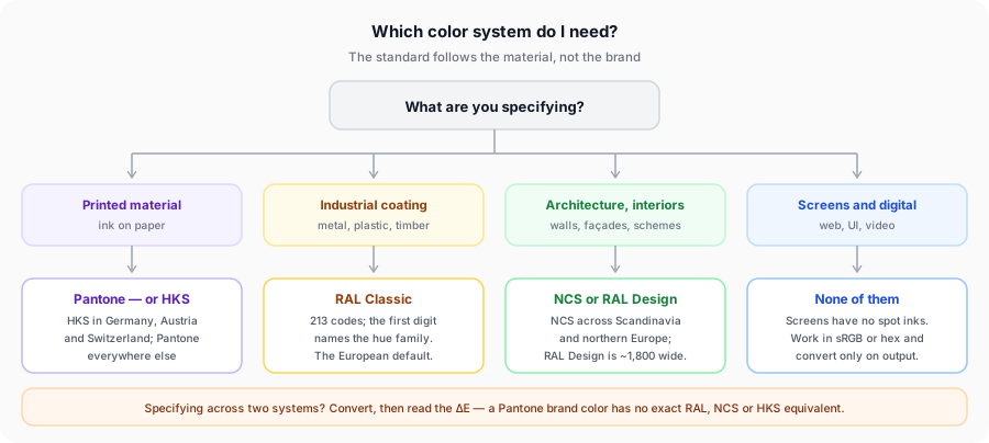
Print and packaging → Pantone, or HKS if you are producing in Germany, Austria or Switzerland. Both are offset spot inks; the choice is about what your printer stocks and what the brand book already specifies.
Product and industrial design → RAL Classic, effectively without exception in Europe. If it is powder-coated, sprayed or extruded, the supply chain speaks RAL.
Architecture and interiors → NCS across Scandinavia and much of northern Europe, RAL Design elsewhere in Europe. Both are built for the muted, systematic ranges that architectural work lives in, and both let you compare colors methodically in a way a Pantone fan deck does not.
Screens → none of them. Digital work has no spot inks. Stay in sRGB and hex, and convert only when something physical is being produced.
Common Conversion Pitfalls
Trusting the screen. Every color in this article is shown to you as an sRGB approximation, and sRGB cannot display large parts of what these systems cover — saturated RAL signal colors and Pantone's neons among them. The on-screen swatch is a label, not the standard. The standard is the physical chip.
Ignoring substrate and finish. This catches people in every direction. The same RAL code looks different matte and gloss, and different again on steel versus timber. HKS 43 K and HKS 43 N are one ink on two papers. Pantone splits the same problem into its C and U suffixes, which the coated versus uncoated explainer covers properly — and if you convert from the wrong suffix, everything downstream inherits the error.
Round-tripping. Converting Pantone to RAL, then that RAL code to NCS, compounds two approximations. If you need a color in three systems, convert from the original source each time rather than chaining.
Assuming a poor result means a broken tool. A ΔE of 12 against RAL Classic usually means the deck genuinely has nothing near your color, which is worth knowing early. The answer is a custom coating match from a physical sample, not a different converter.
Frequently Asked Questions
Related Tools
Match any PMS color to the closest of the 213 RAL Classic codes.
Start from a RAL code and find the nearest Pantone spot color.
HEX and RGB screen values for RAL Classic codes.
Find the closest RAL Classic color for any hex code.
Translate Pantone into Natural Colour System notation.
Find the closest HKS base ink for German-language print work.
The Color Finder system used across Japanese printing.
The device-independent values every ΔE figure here is calculated from.
Convert between the standards
Pick the direction you need, then read the ΔE before you commit it to a specification. Every result is ranked by CIEDE2000 and runs entirely in your browser.